Hi-Lo Diner / Website

Goal:
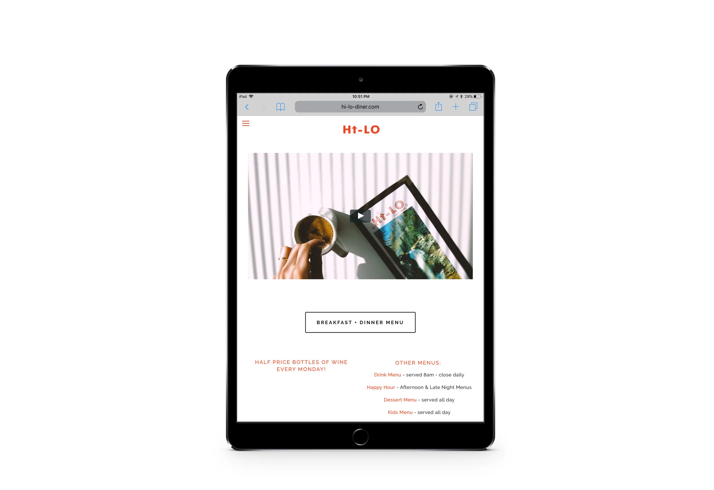
While we wanted it to feel like walking back into the 1950s when you walked into the Hi-Lo Diner, we still needed a sleek and modern website befitting the modern era.


Answer:
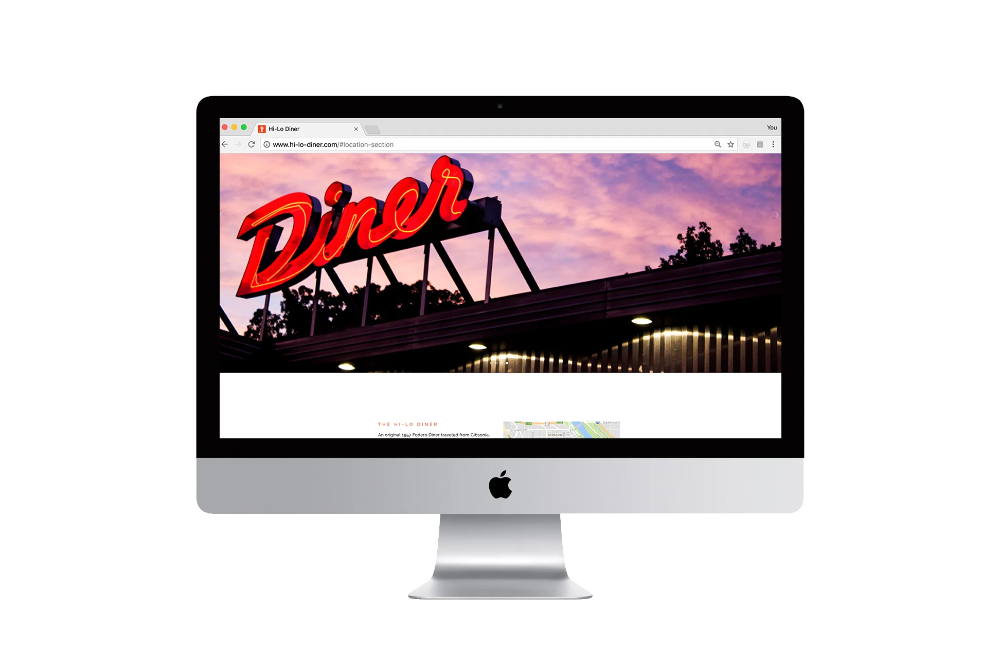
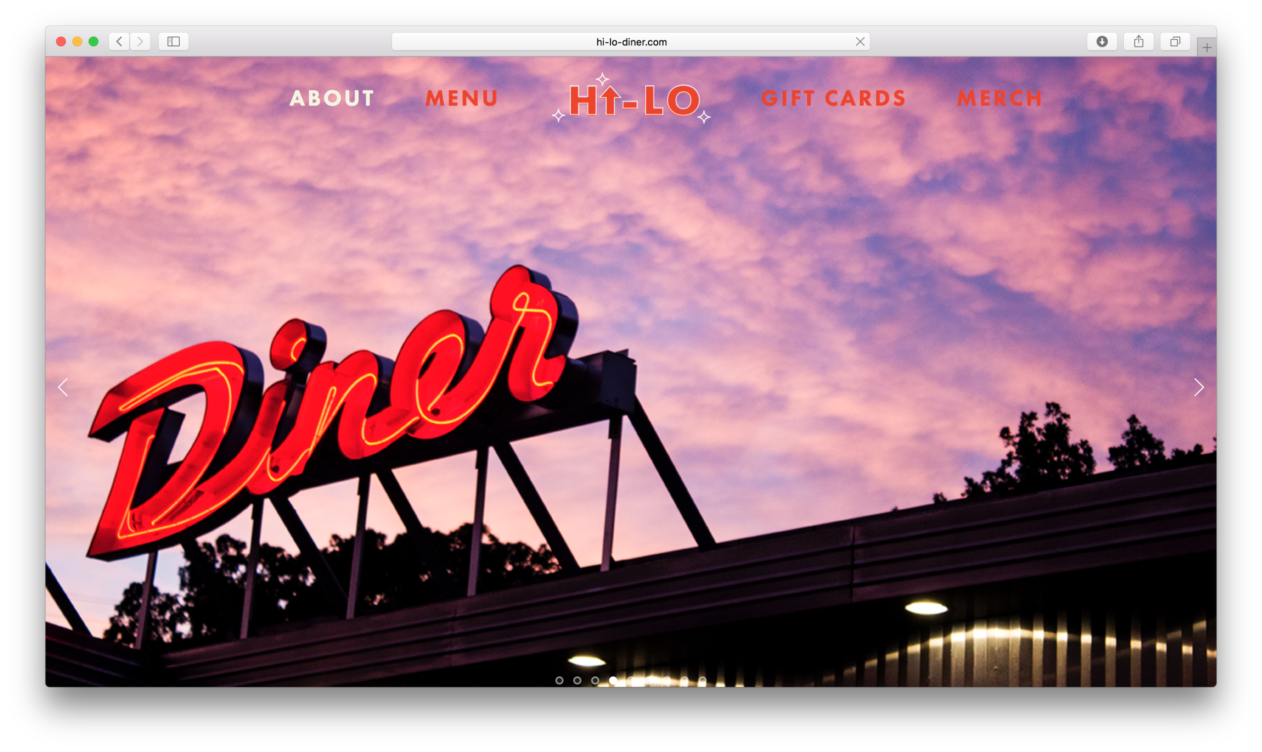
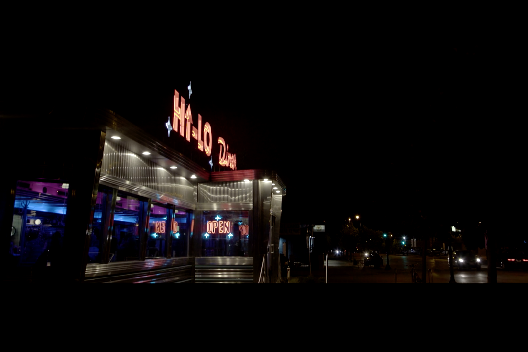
A simple idea: create a website as aesthetically pleasing & welcoming as the diner. Anchoring the main page are images of the diner facade at sunset, piping hot breakfast plates, & late night vibes at the bar. Dynamic images span the full width of the page to make the user feel like they themselves are seated at the counter.
–
Featured in Squarespace's Minneapolis customer spotlight Sept. 27, 2017.

What I did:
Design, UX, copy, videography, photography.
*Image on iPad by Eliesa Johnson
